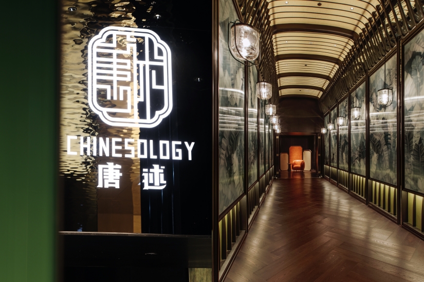
Walking through the third floor of Central IFC mall, you will find a corner with an entrance that has a deep and endless view, utilizing geometric spatial design to create a three-dimensional structure visually. The light extends from bright to dark all the way into the interior, and with only a female hostess standing at the entrance, the atmosphere becomes even more intriguing. As you try to get closer, you will slowly discover that above the entrance, the words “Chinesology 唐述” are constantly reflected.
Tang Shu is a concept Chinese restaurant under Mira Dining, specializing in high-end modern Chinese cuisine. The restaurant’s name conveys the meaning of narration, expressing the philosophy of Chinese food through form, pronunciation, events, and objects. However, in addition to the various crafted dishes on the menu, the interior design of Tang Shu is also a part that must be appreciated.
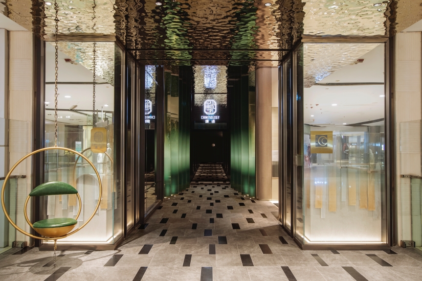
Designed entirely by the local design studio Nichole Choi Studio, Tang Shu is inspired by the architectural style of the Tang Dynasty, combined with vivid colors reminiscent of an exotic Eden, creating a harmonious blend of Eastern aesthetics and modern dining experience in the Chinese restaurant. Starting from the entrance, the design team welcomes guests into this “Eastern Mansion” with modern emerald screens on both sides, while the ceiling reflects shimmering lights like rippling water mirrors. Drawing inspiration from traditional Chinese pavilions and a design with vertically intersecting forms, the entrance area is greatly enhanced in terms of spatial perception and atmosphere, maintaining a sense of mystery in the eyes of the diners.
Unlike traditional Chinese restaurants, Tangshu combines elements of a bar, lounge, and even a private club. To embody such unconventional creative ideas, the design team at Nichole Choi Studio also attempts to showcase this concept through interior design.
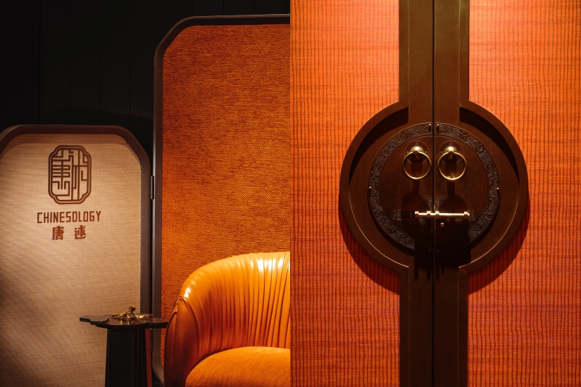
Walking into the entrance, the corridor is surrounded by glass inlaid panels with abstract garden patterns, echoing the Tang Dynasty architectural culture that combines natural elements, guiding diners to the next area – the lounge. The hazy brick walls, unique wall lights, and specially customized three-dimensional wave-textured glass partitions reflect each other, perfectly blending traditional Chinese elements with modern Hong Kong style. The wine cellar with custom metal mesh door design and adjacent gradient mirrors, along with the rough concrete walls, create a strong contrast, giving the lounge a sense of time and space dislocation.
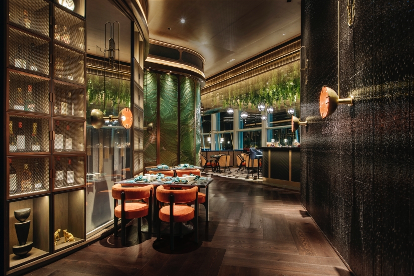
Passing through the corridor, you will find a bar designed with a reversed Chinese pagoda as its blueprint. The ceiling is transformed into an aerial garden with hanging plants, while the team decorates the bar with shimmering bead curtains and glass mosaic tiles. The dazzling aerial garden is further accentuated with hexagonal glass chandeliers, custom-made furniture, and glossy bamboo-like ceramic tiles, creating a striking contrast. The vibrant beauty of Victoria Harbour seeps in through the large glass walls, injecting energy into the bar.
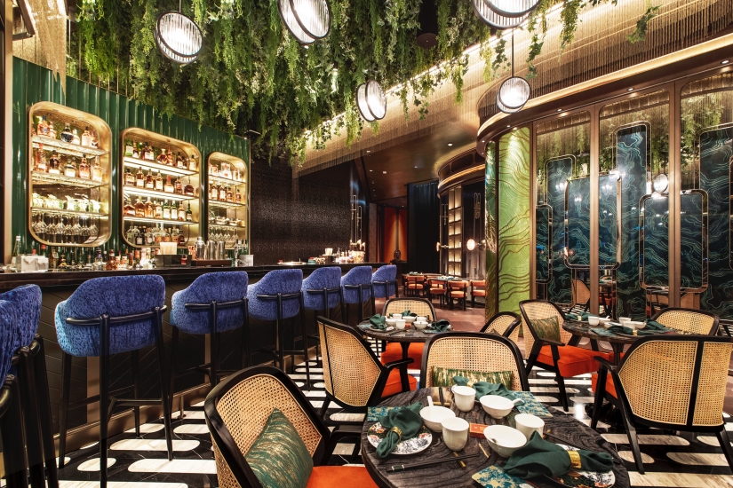
The design of the main dining area, as the focal point of the Tang Dynasty, mimics the ripples of a pond, enhanced by abstract geometric floor tiles, highlighting the imagery of flowing water.
The design team shared that the seating design in the lobby can be adjusted at will, aiming to create a gathering place for guests. In Chinese culture, the courtyard is a place for family gatherings, so the team deliberately focused on this meaning. They first referenced the effect of the Tang Dynasty courtyard gardens without a ceiling, then cleverly used mirror design to enhance light and shadow reflection. Taking film as inspiration, they used a wooden frame to frame the mirror to create a ceiling, symbolizing capturing every precious and unforgettable moment for guests. The natural wave lines presented by the U-shaped pendant are inspired by the contours of water ripples, creating an engaging spatial layout when light shines on the ceiling. As for the back of the main dining room, the designer covered it with custom gold-plated burnt wood texture walls, adding a finishing touch to the space.
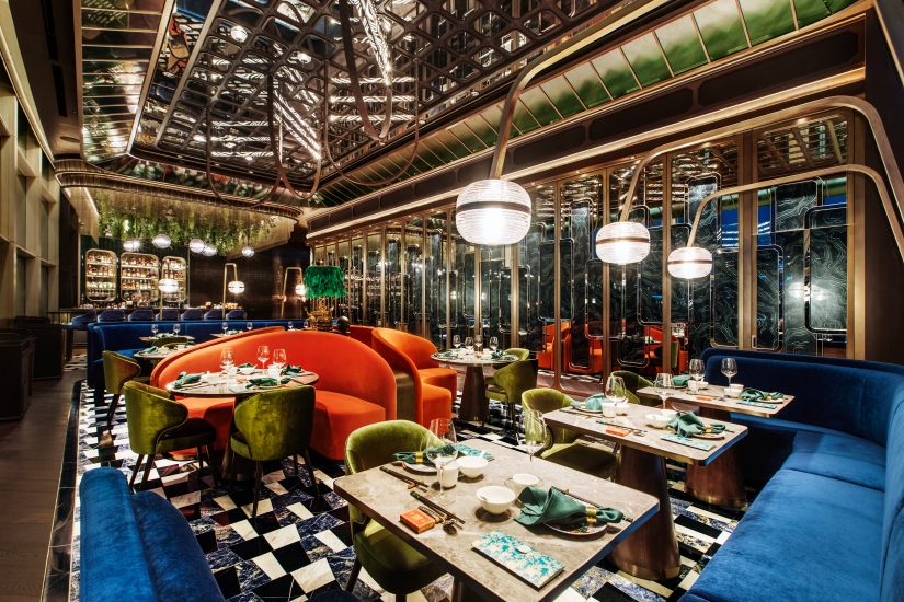
Designers use bright and bold colors and materials when creating Tang Shu, reinterpreting luxury living in a modern style, inheriting the unique culture of the Chinese nation through design, and depicting exotic natural landscapes. Therefore, after exploring the VIP room from the main dining room, you will find that the ceiling height of the VIP room and the main dining room are different. The designer intentionally made the ceiling of the VIP room closer to eye level, easily attracting the guests’ gaze to this area.
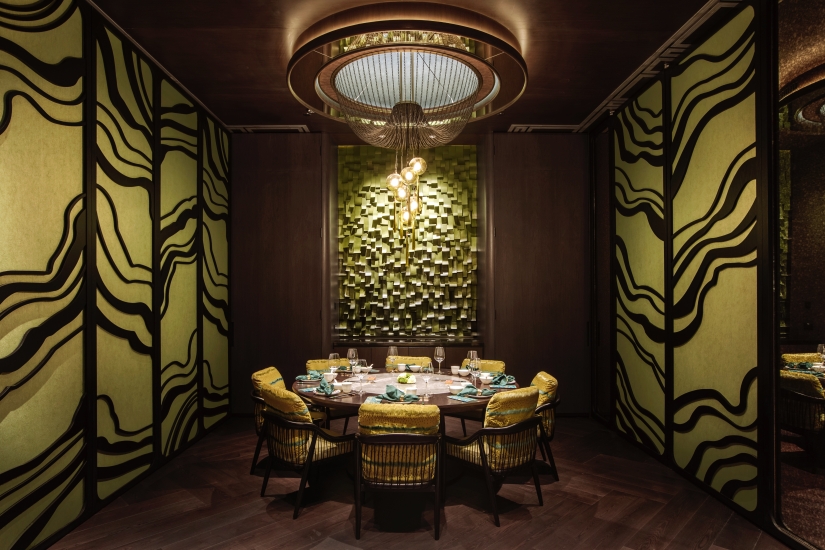
Tang Shu has three VIP rooms, each presenting a unique color scheme, theme, and style. Two of them interpret the changes of the seasons, while the more spacious private dining area depicts an abstract style of the Garden of Eden, once again echoing the core of the entire design concept. The VIP rooms are adorned with unique bubble lights hanging from the ceiling, allowing guests to feel as if they are underwater, experiencing the layers of handcrafted leather stripes on the seats while admiring their soft, gradient colors, as if dancing with coral reefs.
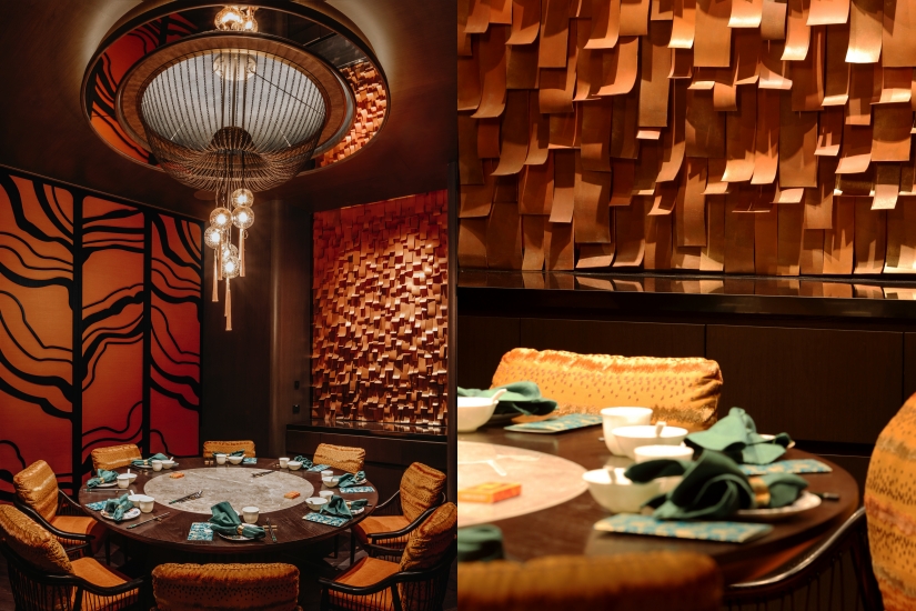
I have always believed that many people easily overlook the “environment” when it comes to dining experiences, not just in terms of hygiene, space, lighting, etc., but whether it can elevate the dining experience to a sublime level. For restaurants like Tang Shu, which are based on a philosophy of dining, it is necessary to have the design team of Nichole Choi Studio put such meticulous thoughts into the layout of the restaurant.
資料及圖片來源:Nichole Choi Studio

