
Korean beauty brand INNISFREE has always been loved by young women with a modest income. Recently, the brand released a completely new brand image, including a new logo, colors, and packaging. It’s been 5 years since their last update, and it’s the first time in 20 years that they’ve changed their font! However, netizens are expressing dissatisfaction with the new logo and demanding that the brand withdraw it. Do you like INNISFREE’s new logo or not?
INNISFREE changed its logo for the first time in 2018, replacing the “Nature Bowl” symbol from 2007 to 2018 with a concise and flexible all-English logo. This year, it has once again adopted a new logo design using a sans-serif font, marking the first font change since the brand’s establishment in 2000 and injecting a fresh and vibrant energy into the brand. The gradually simplified logo also reflects the brand’s pursuit of an environmentally friendly and green lifestyle.
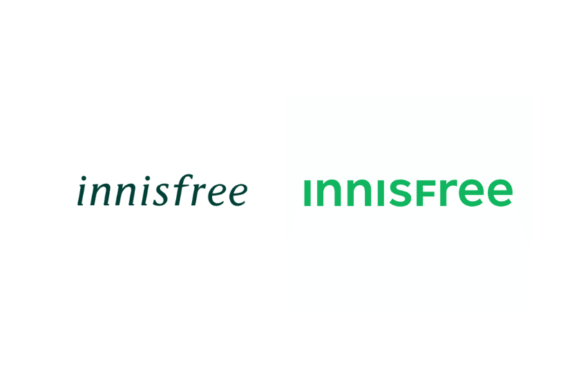
The new logo combines a stable typeface with uppercase and lowercase English letters, presenting a brand image that is close to rationality, science, and vitality, while expressing INNISFREE’s consistent philosophy of embracing diverse beauty. The brand will transform the forest green color that has always been used into a bright and technologically advanced Active Green, expressing a brand image that is actively confident.

The brand name INNISFREE originally carries the meaning of “an island where the skin rests”. The new slogan “Extracting the efficient and natural skincare power from the island” directly tells the main story of the brand: THE NEW ISLE, full of mysterious power, is located in the center of the blue-green ocean, with lush plants covering the island, perfectly presenting the process of combining the mysterious power of the ocean with the infinite power of nature, interpreting the source of the brand’s green power.
Further reading:
- Perfectly Master CHANEL Styling! Nana Komatsu Maintains Figure Without Dieting, Key is 10 Minutes Before Bed
- 盤點 2023 最新春夏粉底!從話題氣墊粉餅、限量蜜粉到養膚粉底一次看
- 巴黎時裝周:Valentino 2023 秋冬重新定義「Black Tie」,顛覆既定框框
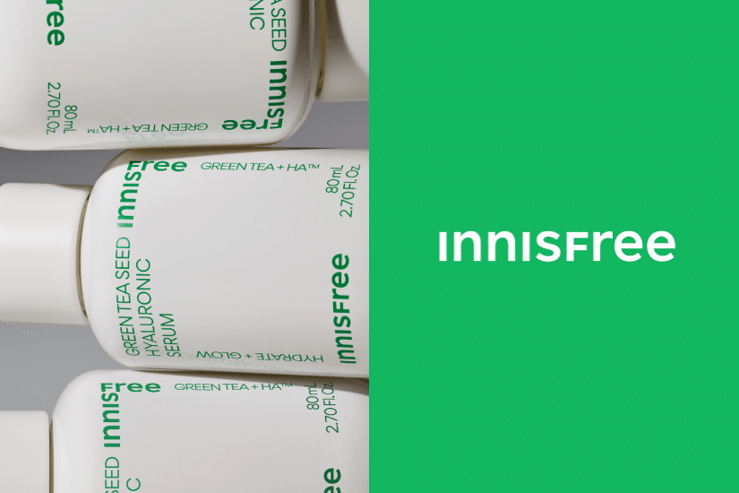
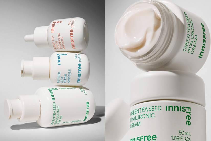
INNISFREE promises to continue bringing vibrant green into life, infusing natural power and effective ingredients into products and packaging, and combining them with eco-friendly containers to perfectly embody INNISFREE’s philosophy of cherishing nature and being free. The new packaging abandons the original green color and adopts a bold pure white, removing the brand’s iconic “green leaf silhouette” to emphasize the brand’s mature and steady characteristics.
INNISFREE has always been deeply ingrained in people’s hearts with its fresh, youthful, and pure image. This brand identity renovation aims to lead the brand towards a “more unified and mature image,” breaking the public’s perception of INNISFREE as synonymous with “fresh and youthful,” in order to further expand into the overseas beauty market. Julien Bouzitat, Vice President and General Manager of INNISFREE USA, expressed the need to establish a natural and healthy image for the brand in order to stand out in the North American market. The products will focus more on scientific methods, natural and sustainable characteristics, in order to attract American consumers.